Choosing the right accent colors can completely transform a space—but knowing which shades work, where to use them, and how to balance them is where most homeowners get stuck. If you’re searching for a clear, practical accent color guide that helps you confidently style your home, you’re in the right place.
This article breaks down how accent colors influence mood, enhance architectural features, and tie together furniture and decor themes. You’ll discover how to select complementary tones, where to introduce bold contrasts, and how to avoid common styling mistakes that make rooms feel overwhelming or unfinished.
Our insights are grounded in proven interior styling principles, real-world room layouts, and carefully tested design combinations that prioritize both beauty and functionality. Whether you’re refreshing a single room or rethinking your entire home concept, this guide will give you straightforward, expert-backed direction to create a cohesive and visually striking space.
Your room feels almost right, yet something’s missing. While some argue color is subjective and you should simply pick what you love, that approach often leads to mismatched tones and visual clutter. Instead, follow a structured accent color guide. Start with the 60-30-10 rule: 60 percent dominant color, 30 percent secondary, 10 percent accent. Because this balance mirrors professional interiors, it creates cohesion. Next, apply basic color theory—complementary colors sit opposite on the wheel and create contrast. In other words, strategy beats guesswork. With a clear plan, bland spaces become intentional, layered, and undeniably inviting. Confidence replaces constant second-guessing entirely.
The Foundation: What is an Accent Color and Why Does it Matter?
An accent color is a hue used in small, intentional doses to create contrast, draw the eye, and inject personality into a space. Think of it as the final seasoning in a dish—it’s not the main ingredient, but without it, everything tastes a little flat. The benefit? Instant visual interest without a full redesign.
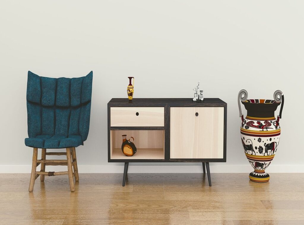
To clarify, your dominant color is typically your wall color. Your secondary color shows up in larger furniture pieces like sofas or rugs. The accent color, however, appears in pillows, artwork, or décor—small touches, big impact.
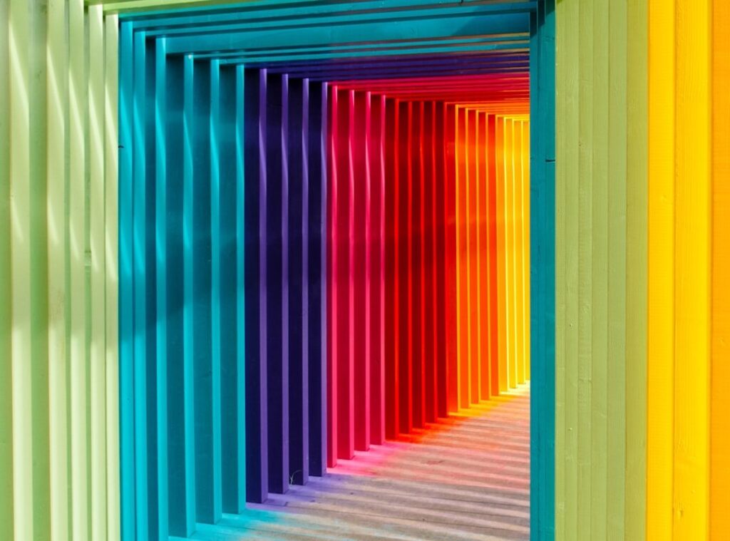
More importantly, accent colors influence mood. A splash of yellow adds energy (hello, sunshine effect). Deep blue signals sophistication. Soft green creates tranquility—like bringing a quiet park indoors.
While some argue neutrals alone feel timeless, a thoughtful pop of color makes a room memorable. If you need direction, an accent color guide can help you choose strategically—and confidently.
Your Blueprint for Balance: Mastering the 60-30-10 Rule
The first time I ignored the 60-30-10 rule, my living room looked like a paint store exploded (and not in a cool, Pinterest-worthy way). I had bold teal walls, a red sofa, and gold accents competing for attention. Lesson learned: balance isn’t boring—it’s powerful.
So what is this rule?
It’s a color distribution formula used in interior design to create visual harmony. Think of it as a pie chart for your room:
| Percentage | Role | Where It Shows Up |
|---|---|---|
| 60% | Dominant Color |
Walls, large rugs, main background |
| 30% | Secondary Color | Sofas, curtains, bedding |
| 10% | Accent Color | Pillows, art, décor pieces |
The dominant color sets the emotional tone. Soft gray feels calm; warm beige feels cozy. The secondary color supports it while adding contrast. The accent color is your personality pop—bold but controlled.
For example: light gray walls (60%), a navy sofa (30%), and mustard yellow pillows and a vase (10%). The result? Balanced, polished, and intentional.
Some argue strict formulas limit creativity. I get that. Design should feel expressive. But structure actually frees you to experiment safely (like jazz with a rhythm section). Once the base is steady, bold accents shine.
If you’re unsure where to start, follow an accent color guide to test small décor swaps before committing.
Pro tip: If something feels “off,” check your proportions first—it’s usually a ratio problem.
And don’t forget lighting. Color shifts dramatically depending on bulbs and placement, which is why understanding lighting highlights how to use lamps and fixtures to transform a room makes a noticeable difference.
Balance isn’t restrictive. It’s your blueprint.
Finding Your Perfect Match: How to Choose Your Accent Hue
Choosing the right accent hue can feel oddly intimidating (it’s just paint… until it isn’t). But when you understand a few foundational principles, the process becomes empowering instead of overwhelming. Even better, the payoff is immediate: a room that feels intentional, balanced, and unmistakably yours.
First, let’s simplify things with the color wheel—a visual tool that shows relationships between colors. Think of it as your personal accent color guide for creating combinations that actually work.
Using the Color Wheel
Two of the most reliable approaches come straight from this classic design tool:
- Complementary Colors: Hues directly opposite each other on the wheel (like blue and orange). This pairing creates high contrast and visual energy. The benefit? Instant vibrancy. Your space feels dynamic and alive—great for social areas like living rooms or kitchens.
- Analogous Colors: Shades that sit next to each other (such as blue, blue-green, and green). These combinations feel harmonious and serene. The result is a cohesive, calming atmosphere—perfect for bedrooms or reading nooks.
On the other hand, some argue that strict color rules can make a space feel formulaic. That’s fair. However, these frameworks aren’t limitations—they’re launchpads. Once you understand them, you can bend them confidently.
Drawing Inspiration from an Existing Piece
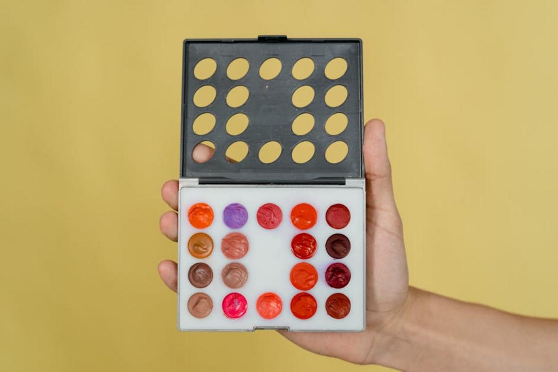
If the wheel feels abstract, look around. Is there artwork, a rug, or a patterned pillow you already love? Pull one standout shade and use it as your 10% accent. This creates unity without guesswork.
Ultimately, the benefit is clarity. Instead of second-guessing every swatch, you’ll choose with purpose—and enjoy a space that feels thoughtfully complete.
Putting theory into practice means letting color move from the page into your living room.
Start small and safe.
- Textiles like throw pillows, blankets, and towels let you test a shade without commitment. You’ll see how a saffron pillow glows against a neutral sofa, how a velvet emerald throw feels cool and plush beneath your fingertips.
- Decorative objects such as vases, bowls, or lamps catch the light, casting tinted reflections across walls.
Artwork can anchor everything; one bold canvas becomes your accent color guide, pulling hues into the room with intention.
Go bold, with caution.
A single painted chair or set of kitchen stools hums with personality, almost like a drumbeat in a quiet song. An accent wall behind a bed or fireplace should feel intentional, wrapping the space in color the way warm sunlight wraps skin.
Step back and notice how the room suddenly breathes differently. Trust your senses.
Your Next Step to a More Colorful, Intentional Home
You’ve learned how to fix a bland room with a strategic accent color. Now it’s about action.
Design A: random pops that compete.
Design B: balanced contrast guided by the 60-30-10 rule and the color wheel.
B wins, every time (yes, even if you love neon).
Keep it simple:
- Bold choice
- Layer with neutrals
- Test before committing
Think of the accent color guide as training wheels.
Pro tip: start with a pillow or vase and watch the shift. Small move, big energy. Place it, step back, and notice the lift instantly.
Bring Your Vision to Life with the Right Finishing Touches
You came here looking for clarity on how to pull your space together with confidence—and now you have a clear direction. From choosing cohesive elements to applying a balanced accent color guide, you’re no longer guessing. You understand how the right tones, textures, and placement choices can completely transform the feel of your home.
The frustration of mismatched decor or rooms that feel “almost right” ends when you follow a structured approach. Small styling missteps can make a space feel cluttered or incomplete—but intentional design choices create harmony, flow, and personality.
Now it’s time to take action. Revisit your space, apply the accent color guide, and start refining one area at a time. If you want expert-backed ideas, practical setup tips, and proven styling breakdowns trusted by thousands of home enthusiasts, explore more inspiration and start your next room refresh today. Your perfectly styled space is one thoughtful decision away.
 Vorric Dolthane, the founder of Ththom Ideas, is a dedicated visionary focused on transforming living spaces through thoughtful interior styling and Thom-inspired decor. By combining expert technical insights with practical, everyday setup tips, he empowers others to create homes that are both sophisticated and deeply functional. Under his guidance, the platform has become a go-to resource for modern home inspiration and masterful design concepts.