Choosing the right blog layout can completely change how your content is experienced. If you’re searching for a clear, side‑by‑side blog layout comparison, you likely want to understand which format best suits your style, audience, and goals—without wasting time testing every option yourself.
This article breaks down the most popular blog layouts, highlighting their strengths, limitations, and ideal use cases. Whether you’re focused on visual storytelling, structured educational posts, or minimalist inspiration boards, you’ll find practical insights to guide your decision. We go beyond surface-level descriptions by analyzing usability, reader engagement patterns, and real-world design applications to help you make a confident choice.
Our recommendations are grounded in hands-on experience with interior-focused content presentation, layout structuring, and aesthetic optimization. By the end, you’ll know exactly which layout aligns with your content vision—and how to implement it effectively.
Crafting the Perfect First Impression: How to Choose a Blog Layout
As we explore the distinct advantages of the Highlight Hub versus traditional blog layout, it’s also worth noting how such aesthetic choices can influence the overall feel of your space, much like in our article on ‘Mix and Match: Blending Patterns Without Overwhelming the Space.’
Your layout is more than decoration; it shapes attention, trust, and action. Choosing well means balancing beauty with strategy. Start with a simple blog layout comparison to see how grids, single column, or magazine styles guide the eye.
Readers often think visuals alone win, but structure quietly controls scrolling behavior.
Future facing design will likely favor modular sections and adaptive typography as screen habits evolve this is speculation.
Use this checklist:
- Define your primary goal.
- Map visual hierarchy.
- Test real user flow.
Pro tip: measure time on page
The Focused Narrative: The Single-Column Layout
At its core, a single-column layout is exactly what it sounds like: one vertical stream of content, stacked from top to bottom. No sidebars. No competing panels. Just a clear path for the reader’s eyes. In other words, it removes visual clutter so the story can breathe.
So, why does that matter? First, readability improves dramatically. Because the eye follows a natural downward rhythm, readers don’t have to “hunt” for the next line (think of how smoothly you scroll through a long-read article on your phone). It’s also mobile-native by design, meaning it works seamlessly on smaller screens without rearranging blocks.
However, some argue it’s too simple. In a blog layout comparison, multi-column designs can showcase recent posts, ads, or promotions more aggressively. That’s true. A single-column setup limits discovery opportunities and space for calls-to-action.
Still, if your goal is immersive storytelling or minimalist aesthetics, this format shines. Pro tip: use strong subheadings to prevent long stretches of text from feeling overwhelming.
Ultimately, when the written word is the hero, fewer distractions make a stronger stage.
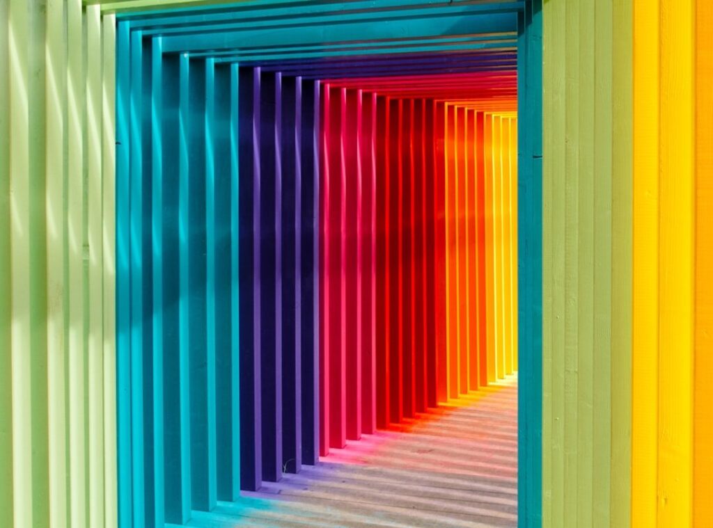
The Visual Showcase: The Magazine & Grid Layout
The Magazine or Grid layout is built for VISUAL IMPACT. Instead of listing posts one by one, it arranges multiple articles in a dynamic grid with featured images in different sizes. Think of it like walking into a well-designed bookstore—your eyes jump from cover to cover (and yes, that’s the point).
Why people love it:
• High content density encourages exploration
• Visually engaging and modern
• Ideal for showcasing LOTS of content at once
For food, travel, or news-heavy sites, this format works because imagery is the hook. A vibrant pasta dish or a dramatic skyline instantly pulls readers in. In any blog layout comparison in the section once exactly as it is given, the grid style often wins for variety and browsing potential.
But here’s the catch. Without strong design rules, it can feel cluttered. Too many colors? Overwhelming. Low-quality images? Distracting. Slow-loading pages? Frustrating (and users will leave).
Pro tip: Compress images and stick to a consistent color palette to keep the layout polished and FAST.
If your content relies on visuals to tell the story, this layout delivers BIG results.
The Classic Communicator: The Sidebar Layout

The sidebar layout is a traditional website structure with a wide main content area and a narrower column sitting beside it. That smaller column—called a sidebar—typically houses navigation links, recent posts, ads, or email sign-up forms. In simple terms, it’s the website equivalent of margin notes in a textbook.
First, let’s talk advantages. A sidebar is excellent for organizing categories and guiding readers to related content. It also provides dedicated space for author bios, lead magnets, and promotions without interrupting the main article. For example, educational blogs often use sidebars to highlight downloadable resources or link to cornerstone guides like how to create a weekly content highlight hub that keeps readers engaged. In a blog layout comparison, this structure often wins for structured navigation and monetization clarity.
However, there are trade-offs. Some argue sidebars feel outdated, and studies on “banner blindness” suggest users often ignore peripheral content (Nielsen Norman Group). On mobile, sidebars usually stack below content, reducing visibility.
Still, for authority-driven, business, or educational sites focused on lead generation, the sidebar remains practical and effective when styled with a modern, minimal approach.
The Modern Edge: Asymmetrical & Split-Screen Designs
Asymmetrical design breaks the traditional grid system (a structured layout where elements align evenly). Instead of perfect balance, it uses intentional imbalance—overlapping visuals, bold negative space (empty areas that give elements room to breathe), and unexpected alignment. Split-screen layouts divide the page into two distinct sections, often contrasting color, imagery, or messaging.
First, let’s be clear: this style isn’t for the faint of heart. Done well, it’s striking and unforgettable. Done poorly, it feels like your website tripped over itself. Some argue asymmetry hurts usability—and they’re not wrong. Nielsen Norman Group research shows users prefer familiar patterns for navigation (NNG, 2020). However, when hierarchy and spacing are deliberate, creativity doesn’t have to sacrifice clarity.
If you want to stand out, choose this approach intentionally. Start with a blog layout comparison to see how traditional grids differ from split-screen formats. Then test navigation flow before launch (pro tip: heatmaps reveal confusion fast).
Ultimately, this style works best for portfolios, fashion-forward brands, and creative agencies ready to look bold—not basic.
How to Choose: Aligning Layout with Your Blog’s Purpose
Choosing a blog layout sounds simple—until you realize it affects how people read, click, and buy. Let’s break it down clearly.
Analyze Your Content Type
Start with your primary format. If your blog is text-heavy, a single-column layout (one vertical stream of content) keeps readers focused. Think of it like reading a novel—no distractions. If you rely on visuals, a grid layout (multiple content blocks displayed side by side) showcases images efficiently, similar to an online gallery. This basic blog layout comparison helps remove guesswork.
Understand Your Audience’s Goal
Ask: are visitors here for one solution, or to explore? A focused layout supports quick answers. A grid encourages discovery (like browsing Netflix thumbnails—easy to keep clicking).
Consider Your Monetization Strategy
If ads generate revenue, sidebars create structured space without interrupting the article flow. Selling one product? A minimalist design guides attention to a single call-to-action. Clarity converts better than clutter.
The Mobile-First Test
More than half of web traffic comes from mobile devices (Statista). If your layout breaks on a phone, it fails. Test scrolling, spacing, and load speed carefully.
• Keep navigation simple.
• Prioritize readability over decoration.
When in doubt, choose function over flash (your bounce rate will thank you).
From Inspiration to Implementation: Your Next Steps
You now understand the core layouts. The real challenge was never picking something that looks good—it was choosing one that moves readers toward action.
A smart blog layout comparison focuses on three concrete factors:
- Content structure: Long-form guides need clear headings and scroll cues (which boost readability and time on page).
- Audience behavior: Visual learners benefit from image-forward grids; analytical readers prefer structured columns.
- Monetization paths: Email forms, product blocks, and CTA placement directly impact conversions.
Sketch your user’s journey across your top three layouts. The smoothest path from entry to conversion? That’s your winner.
Bring Your Thom-Inspired Space to Life Today
You came here looking for clear, practical inspiration to refine your space with purposeful, Thom-focused design. Now you have the direction, styling approaches, and setup strategies to turn scattered ideas into a cohesive, inspired home.
The truth is, most people struggle with pulling a room together. They feel overwhelmed by mismatched decor, uncertain layouts, and concepts that look good online but fall flat in real life. With the right structure and styling insight, that frustration disappears — and your space finally feels intentional.
Now it’s time to act. Choose one room, apply the concepts you’ve learned, and start implementing the layout and decor adjustments step by step. If you want expert-backed guidance trusted by thousands of design-focused readers, explore our most popular styling breakdowns and practical setup guides today.
Don’t let your ideas stay ideas. Transform your space into something cohesive, functional, and uniquely Thom-inspired — start now.
 Helen Rogersofers is a leading expert in functional home optimization and contemporary decor themes. She specializes in translating high-level design theory into practical, accessible setup strategies that maximize the potential of any floor plan. Through her insightful breakdowns and focus on material textures, Helen empowers individuals to refine their surroundings with confidence, making sophisticated design achievable for the everyday enthusiast.