Creating a home that feels balanced, inspiring, and uniquely yours starts with understanding the deeper impact of design choices. Many homeowners struggle to translate ideas into cohesive spaces that look intentional rather than mismatched. This article is designed to guide you through practical home concepts, smart interior styling approaches, and themed decor ideas that bring clarity to your vision.
We’ll explore how layout decisions, textures, lighting, and especially color psychology in home design influence mood, functionality, and overall harmony. Whether you’re refreshing a single room or rethinking your entire space, you’ll find actionable setup tips and clear explanations to help you make confident design decisions.
Our insights are grounded in proven styling principles, real-world applications, and careful analysis of what truly works in modern interiors. By the end, you’ll have a stronger understanding of how to shape a home environment that feels both aesthetically refined and personally meaningful.
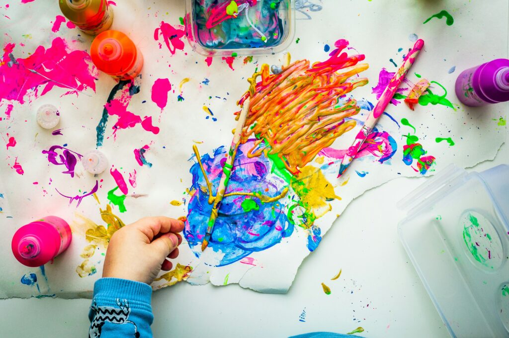
Choosing paint can feel paralyzing, especially when every shade promises a different mood. However, once you understand how color psychology in home design works, decisions become clearer. For example, soft blues often promote calm, making them ideal for bedrooms, while warm terracottas energize social spaces. Meanwhile, neutrals create flexibility if you love changing décor (and who doesn’t?).
Start by asking:
- What feeling do I want here?
- How much natural light enters?
- Which existing pieces must stay?
Then, test samples on different walls, observing them morning and night. As a result, your palette will feel intentional, cohesive, and deeply personal. Ultimately.
The Psychology of Hues: Setting the Mood Room by Room
Color is not just decoration—it is DIRECTION. The right shade can shift energy, influence mood, and even affect behavior. When you use color psychology in home design, you move from random decorating to intentional atmosphere-building.
1. Warm Colors: Energy and Connection
Reds, oranges, and yellows are stimulating hues. They increase heart rate and spark conversation (there’s a reason fast-food chains love red—studies show it can stimulate appetite, per color research from the Institute for Color Research).
Choose warm tones for:
- Dining rooms
- Kitchens
- Social lounges
Recommendation: If full red feels overwhelming, try a burnt orange accent wall or mustard-toned chairs. KEEP IT BALANCED.
2. Cool Colors: Calm and Clarity
Blues, greens, and soft purples promote relaxation and mental clarity. Blue, in particular, has been linked to reduced stress levels (University of Sussex research suggests cool tones can support calm focus).
Best for:
- Bedrooms
- Bathrooms
- Home offices
Pro tip: Opt for muted sage or dusty blue instead of overly bright shades—they soothe without feeling cold.
3. Neutrals: Sophistication and Space
Grays, beiges, and whites act as visual breathing room. They reflect light and make rooms appear larger. Think of them as the stage crew letting your furniture be the star (yes, even that bold velvet sofa).
Use neutrals when you want:
- A clean aesthetic
- Flexibility in decor swaps
- A timeless foundation
Practical Application
- For a creative boost → Warm yellows or coral
- For ultimate relaxation → Soft blue or sage green
- For focus and productivity → Cool gray with blue undertones
- For elegance → Layered beige and cream
As designers say, “Color sets the tone before furniture says a word.” Choose wisely.
Beyond the Paint Chip: The 60-30-10 Rule for Perfect Balance
If you’ve ever painted a room and thought, Why does this feel… off? the problem likely isn’t the color—it’s the balance. That’s where the 60-30-10 rule comes in. This classic design principle divides your space into three color proportions to create harmony (think of it as the interior design version of a well-composed Instagram grid).
The 60%: Your Dominant Color
First, choose your main backdrop. This color covers about 60% of the room—typically walls, large rugs, or a main sofa. Neutrals like warm beige or soft gray work beautifully because they ground the space. However, deep navy or sage green can also anchor a room if you want mood.
Practical tip: Test your dominant color on two different walls before committing; lighting changes everything.
The 30%: Your Secondary Color
Next, layer in a supporting hue. This should complement (not compete with) your dominant tone. Use it for:
- Upholstered chairs
- Curtains
- Bedding
- Accent walls
For example, if your 60% is light gray, a 30% dusty blue adds depth without overwhelming the room.
The 10%: Your Accent Color
Finally, add personality with bold touches—pillows, art, vases, or throws. This is your “pop.” Mustard yellow in a navy-and-white room? Instant energy.
Importantly, color psychology in home design plays a role here: blues calm, yellows energize, greens restore.
Example Palettes
- Earthy & Serene: 60% warm taupe, 30% olive green, 10% terracotta.
- Modern & Bold: 60% crisp white, 30% charcoal, 10% emerald green.
For more inspiration, explore 10 modern home design concepts that elevate everyday living.
Creating Illusions: Using Color to Alter Space Perception
Have you ever walked into a tiny room and felt oddly relaxed, almost as if the walls had stepped back? Or stepped into a large space that somehow felt cold and cavernous? That’s not magic. It’s strategy.
Making Small Rooms Feel Larger
Light, cool, and soft colors—think pale blues, gentle grays, and airy whites—reflect more light, which visually expands a room. When walls and trim are painted the same shade, the eye doesn’t “stop” at contrasting edges. As a result, the boundaries blur, and the room feels bigger (a neat visual trick, right?). This approach is rooted in color psychology in home design, where cooler hues are associated with openness and calm. Some argue bold colors add personality to small rooms—and they can—but if spaciousness is your goal, lighter tones usually win.
Making Large Rooms Feel Cozier
On the other hand, does your living room feel more like an echo chamber? Warm, dark, and saturated colors—like deep navy or rich terracotta—absorb light and visually pull walls inward. A dramatic accent wall can anchor the space, making it feel intimate instead of overwhelming. While critics say dark shades shrink rooms too much, in oversized areas that’s often exactly the point.
Raising the Ceiling
Want higher ceilings without renovation? Paint the ceiling a lighter color than the walls, or bright white. The upward contrast draws the eye higher.
The Impact of Finish
Finally, consider finish. Matte absorbs light (great for softness), while satin and gloss reflect it, amplifying brightness. Which mood are you after?
Your Palette, Your Story: Putting Color Theory into Action
You now have the tools. The only thing left? Action.
Start small. Choose one room and decide how you want it to feel. Calm? Energized? Grounded? That emotional goal becomes your compass. When you use color psychology in home design, you’re not guessing—you’re directing mood with intention.
Follow the 60-30-10 rule (a simple formula where 60% is your dominant color, 30% your secondary, and 10% your accent). It keeps rooms balanced, not chaotic (because no one wants their living room to feel like a paint aisle exploded).
Here’s what I recommend:
- Pick a dominant neutral that supports your lifestyle.
- Layer a secondary tone that reinforces your chosen mood.
- Add a bold accent for personality and contrast.
Some argue you should “just trust your instincts.” Instinct matters—but structure prevents regret.
Gather inspiration. Test swatches. Adjust lighting. Then commit.
Three colors. One room. Your story, painted with purpose.
Bring Your Space to Life with Purpose and Confidence
You came here looking for clarity on how to create a home that feels cohesive, inspiring, and truly yours. Now you understand how intentional styling, thoughtful layouts, and especially color psychology in home design can completely transform the mood and functionality of your space.
An uninspired room can drain your energy, feel disconnected, and never quite reflect your personality. The right concepts and practical setup strategies eliminate that frustration. When every element works together, your home stops feeling random and starts feeling intentional.
Now it’s time to take action. Start by choosing one room and applying a focused theme, refine your layout for flow, and select colors that support the atmosphere you want to feel every day. If you’re ready for expert-backed ideas trusted by readers who want stylish yet practical results, explore more curated inspiration and step-by-step guidance now. Transform your space with confidence and create a home that finally feels complete.
 Vorric Dolthane, the founder of Ththom Ideas, is a dedicated visionary focused on transforming living spaces through thoughtful interior styling and Thom-inspired decor. By combining expert technical insights with practical, everyday setup tips, he empowers others to create homes that are both sophisticated and deeply functional. Under his guidance, the platform has become a go-to resource for modern home inspiration and masterful design concepts.