If you’re searching for fresh home concepts and practical interior styling ideas, you’re likely looking for inspiration that goes beyond trends and actually works in real spaces. This article is designed to help you visualize, plan, and execute decor choices that feel cohesive, functional, and distinctly personal.
We break down key styling approaches, Thom-focused decor themes, and smart setup tips that make a noticeable difference—whether you’re refreshing a single room or rethinking your entire layout. Instead of vague inspiration, you’ll find clear explanations of why certain elements work together, how to balance form and function, and what to prioritize for lasting impact.
To ensure accuracy and value, the insights shared here draw from established interior design principles, practical space-planning strategies, and expert-backed decor techniques. The goal is simple: give you the clarity and confidence to transform ideas into a well-styled, thoughtfully curated home.
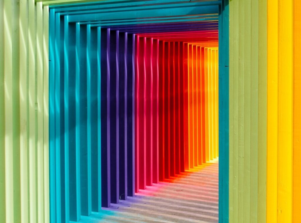
The difference between a flat room and a magnetic one often comes down to a single, deliberate hue. Instead of scattering color randomly, use accent color focal points to guide the eye. It’s about placement, contrast, and restraint.
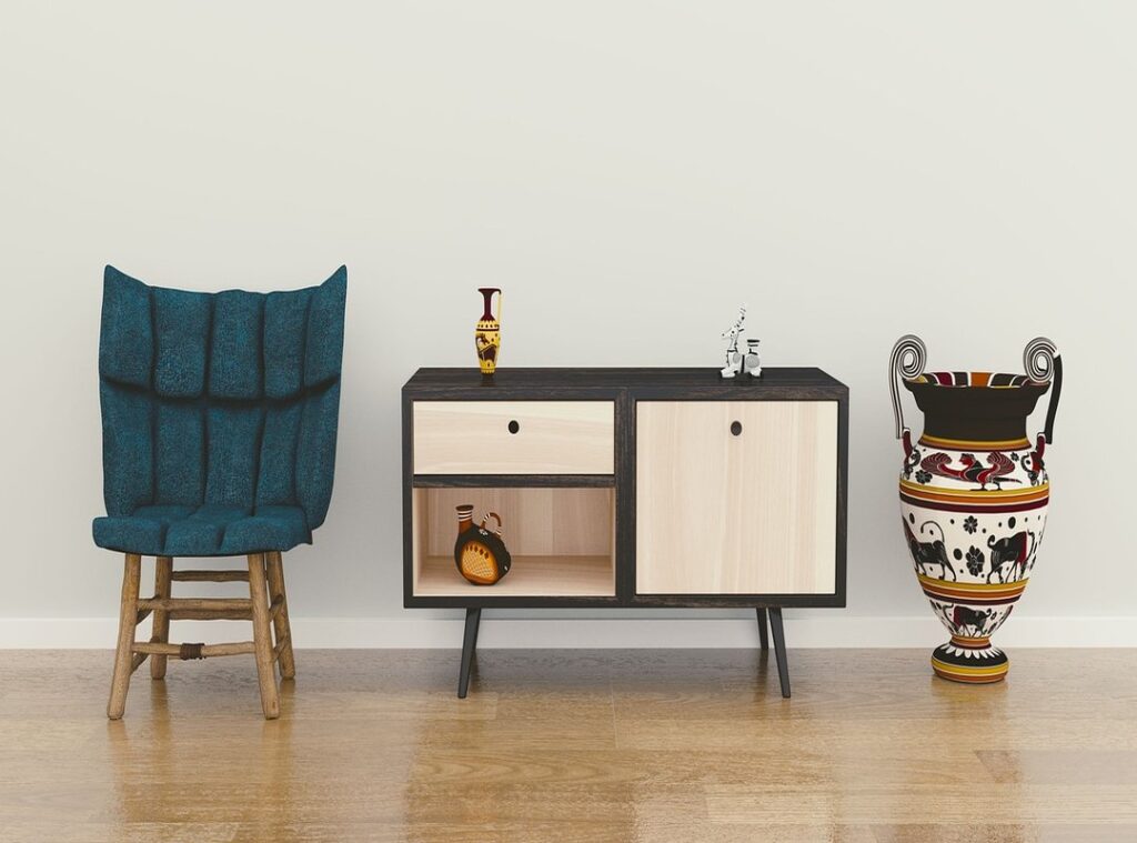
For example, a cobalt chair against neutral walls instantly commands attention (like the hero shot in a film).
To make it work:
- Choose a backdrop in muted tones.
- Repeat the hue once in a small accessory.
- Keep surrounding patterns minimal.
Less really is more. Test swatches in natural and artificial light before committing. This ensures balance, clarity, and lasting impact in any space.
The Psychology of the Accent: Why Your Eyes Follow Color
I once styled a minimalist living room that felt technically perfect—soft gray sofa, ivory rug, pale wood table—yet something was missing. It looked like a showroom no one actually lived in. Then I added one vibrant orange cushion. Instantly, your eyes knew where to land. That’s visual hierarchy at work.
Visual hierarchy refers to how the brain organizes what it sees, prioritizing elements with the most contrast. Studies in visual cognition show that saturated colors naturally command attention because our brains are wired to detect contrast quickly (Palmer, 1999). In a neutral space, an accent becomes a deliberate interruption—a gentle “look here first.”
Color also shapes emotion. A splash of yellow on a bookshelf feels energetic and creative. Meanwhile, a deep teal behind a headboard promotes calm and restoration (Küller et al., 2009). The hue you choose subtly shifts the room’s mood.
Then there’s visual weight—the perceived heaviness of an object based on color and size. Surprisingly, a small bold cushion can balance a large neutral sofa across the room. That’s how accent color focal points create harmony instead of chaos.
Pro tip: If a room feels flat, start small. One intentional pop can change everything.
The 60-30-10 Rule: Your Framework for Flawless Palettes
The 60-30-10 rule is a classic interior design formula for balancing color in a room. Think of it as a visual budget: every shade gets a percentage of space so nothing overspends.
60% – The Dominant Color
This is your primary backdrop, usually on walls. It sets the emotional tone. Neutrals like beige, gray, or off-white are common because they’re versatile and calming. Compare this to using a bold navy on all four walls: beige (A) feels open and flexible, while navy (B) feels dramatic but potentially heavy if overused. The 60% share keeps things grounded.
30% – The Secondary Color
This supports the dominant hue and adds depth. It often appears in furniture, rugs, or curtains. Picture a gray room (60%) paired with a rich blue sofa (30%). Now compare that to a room where blue also dominates 60%. In the first scenario, the space feels layered. In the second, it can feel monochromatic (and a little flat).
10% – The Accent Color
This is your ‘pop.’ The focal point color. It should be used sparingly on small items to create contrast and draw the eye. This is your ‘wow’ factor. Think throw pillows, artwork, or vases. Used correctly, accent color focal points energize a space without overwhelming it (like hot sauce—powerful in drops, disastrous in cups).
Why It Works
Some argue creativity shouldn’t follow formulas. Fair. But structure doesn’t limit expression—it refines it. The 60-30-10 split prevents visual chaos while allowing personality to shine. It’s balance by design.
Strategic Placement: Where to Apply Your Accent Color for Maximum Impact
Before you even open a paint can, decide what deserves attention. An accent color without intention is just noise. Is your focal point a fireplace, a dramatic window view, or a sculptural armchair? Choosing the feature first prevents the all-too-common mistake of highlighting the wrong element (yes, we’ve all seen the random red wall that leads nowhere).
Highlighting Architectural Features: Paint vs. Placement
Option A: Paint a full accent wall. Bold, confident, impossible to ignore.
Option B: Paint the back of a built-in bookcase or the wall behind floating shelves. Subtle, layered, and often more sophisticated.
Side-by-side, Option A commands attention instantly, while Option B rewards closer inspection. If your room already has strong shapes, go subtle. If it lacks personality, go bold. Even a painted front door can outperform an interior wall in impact-per-dollar (pro tip: high-gloss finishes amplify drama).
Creating Focus with Textiles: Permanent vs. Flexible
Paint is commitment. Textiles are freedom.
Throw pillows, a single bold blanket, or patterned dining cushions let you test ideas without long-term risk. A vibrant area rug can anchor furniture more effectively than wall color alone. This is where accent color focal points often succeed—grounded, intentional, and easy to swap when trends shift (looking at you, millennial pink).
The Power of Art & Decor: Large Statement vs. Curated Cluster
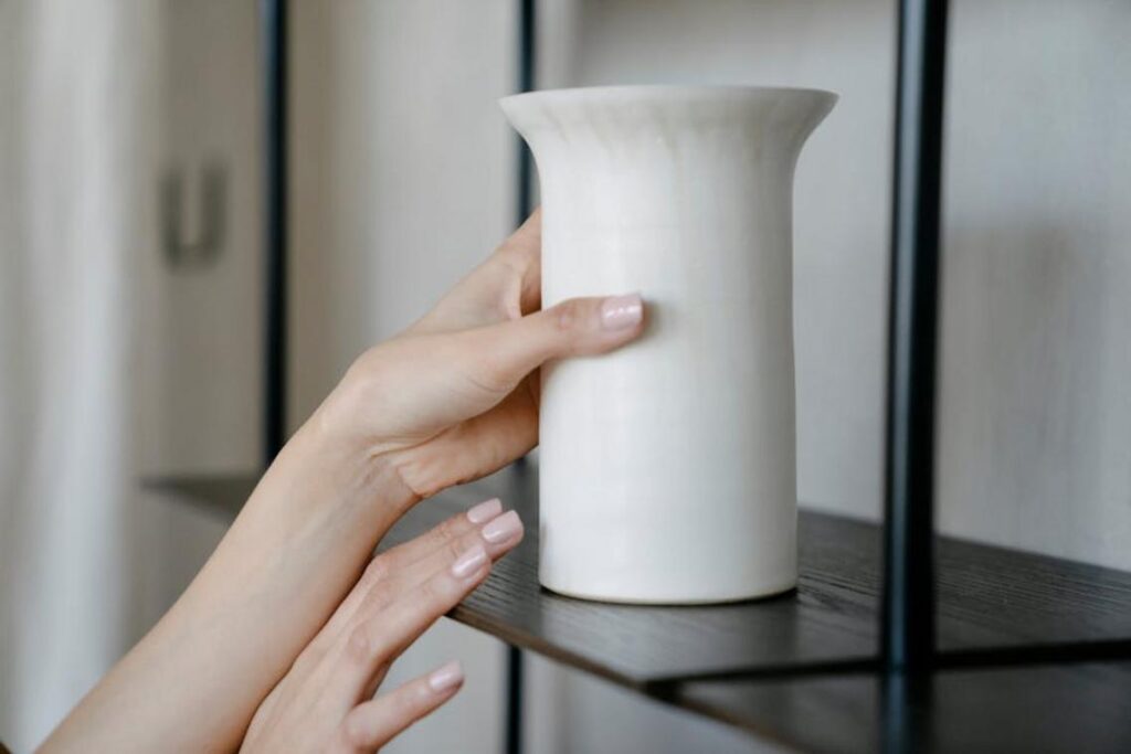
One oversized artwork creates a cinematic effect. A collection of colored vases or a vivid lampshade builds rhythm and repetition. Both can serve as the room’s 10% color anchor.
And remember: color works best when supported by smart lighting. Explore how placement enhances impact with these lighting techniques that make your homes best features shine.
I once turned my living room into what I now call the “confetti crisis.” I’d scattered teal everywhere—vases, candles, throw pillows—creating the dreaded Polka Dot Effect. Instead of a focal point, the room felt visually noisy (like a toddler discovered paint). Accent color focal points work best when concentrated, not sprinkled.
- Forgetting Undertones: I paired a cool blue chair with warm beige walls. They fought constantly. Undertones are the subtle warm or cool hues beneath a main color (think cream vs. gray-based white).
- Too Timid: If your accent barely contrasts, it whispers instead of sings. Pro tip: sample swatches in natural light before committing.
Your Blueprint for Intentional and Striking Design
Random pops of color can make a room feel like a TikTok trend gone wrong. Intentional design, on the other hand, works more like a Wes Anderson frame—every shade placed on purpose. By pairing the 60-30-10 rule (a classic ratio where 60% is dominant, 30% secondary, 10% accent) with focal points, you transform accent color focal points into headlines, not noise.
- Choose one star.
- Support it with restraint.
This system prevents clutter and creates mood with precision. Start today: pick one focal point and crown it with a unforgettable hue.
Bring Your Vision to Life with Confidence
You came here looking for fresh home concepts, inspiring interior styling ideas, and practical ways to bring Thom-focused decor themes into your space. Now you have the clarity and direction to move forward with confidence.
The biggest challenge isn’t finding inspiration — it’s knowing how to pull everything together in a way that feels cohesive, intentional, and truly you. Without a clear plan, it’s easy to waste time, overspend, or end up with a space that doesn’t feel quite right.
Here’s your next step: choose one concept that resonated most and start implementing it room by room. Focus on layout, color harmony, and purposeful decor choices that align with your overall vision. Small, strategic updates create powerful transformations.
If you’re ready to eliminate guesswork and design a space that feels expertly curated, explore more in-depth styling guides and practical setup strategies today. Get inspired, apply the steps, and turn your ideas into a home that feels thoughtfully designed and uniquely yours.
 Helen Rogersofers is a leading expert in functional home optimization and contemporary decor themes. She specializes in translating high-level design theory into practical, accessible setup strategies that maximize the potential of any floor plan. Through her insightful breakdowns and focus on material textures, Helen empowers individuals to refine their surroundings with confidence, making sophisticated design achievable for the everyday enthusiast.