Designing a home that feels cohesive, inspiring, and uniquely yours can feel overwhelming. With endless decor trends, layout ideas, and styling advice online, it’s hard to know what actually works—and what will stand the test of time. If you’re searching for practical home concepts, thoughtful interior styling approaches, and decor ideas that balance beauty with function, you’re in the right place.
This article breaks down smart, achievable ways to transform your space, from selecting complementary textures to understanding color psychology in interiors and how it influences mood, energy, and comfort. You’ll discover clear, experience-backed guidance on creating flow between rooms, choosing statement elements that elevate your design, and setting up spaces that reflect your personality without sacrificing practicality.
Every recommendation is grounded in proven design principles, real-world styling strategies, and a deep understanding of how thoughtful details turn ordinary rooms into inspiring living environments.
How the Colors in Your Home Shape Your Mood
Have you ever walked into a room and felt instantly calm—or strangely restless? I once painted my bedroom a cool sage green, and within days, my sleep improved. That’s the quiet power of color psychology in interiors.
Choosing paint feels permanent (and expensive), which makes it overwhelming. But here’s what I learned: color isn’t just decoration; it’s atmosphere.
- Blues and greens soothe, while yellows and corals energize.
By the end of this guide, you’ll confidently choose hues that spark focus, relaxation, or joy—on purpose, not by accident.
The Unspoken Language of Color: Core Principles
What is Color Psychology in Design?
At its core, color psychology in interiors is the study of how hues influence human behavior and emotion. In other words, the paint on your walls does more than decorate—it quietly shapes mood, focus, and even appetite. Designers in fast-paced cities like New York often lean on this principle to make compact apartments feel expansive (or intentionally cozy).
Warm vs. Cool Tones
Fundamentally, colors split into warm and cool families. Warm tones—reds, oranges, yellows—advance visually and energize a room. Think of a bustling restaurant wrapped in terracotta. Cool tones—blues and greens—recede and calm, which is why coastal homes in California favor misty blues.
Intensity and Saturation Matter
However, saturation changes everything. A muted blue feels grounded and serene, while a highly saturated cobalt pulses with energy (hello, modern art gallery vibes). Pro tip: lower saturation in bedrooms to reduce visual noise.
Personal and Cultural Associations
Finally, perception isn’t universal. Cultural traditions, regional palettes, and personal memories all shape how color lands emotionally.
Energize and Connect: The Psychology of Warm Hues
Warm colors don’t just change how a room looks—they shift how it feels. That’s the power of color psychology in interiors: certain hues subtly influence mood, energy, and even behavior.
Reds (Passion, Appetite, Energy)
Red is stimulating. It can raise heart rate and spark conversation (there’s a reason many restaurants use it; studies show red can increase appetite, according to research published in Appetite journal). In dining rooms or entryways, red creates a bold first impression. However, in bedrooms—where calm matters most—it may feel too intense. If you love red, try:
- A feature wall
- Upholstered dining chairs
- Statement artwork
Oranges (Enthusiasm, Creativity, Warmth)
Orange feels playful and social. It works beautifully in creative studios, home gyms, or playrooms. Because it’s high-energy, use it as an accent—think throw pillows or a painted desk—to avoid overwhelming the space.
Yellows (Happiness, Optimism, Attention)
Yellow mimics sunlight, making kitchens and breakfast nooks feel bright and welcoming. Softer buttery tones uplift without glare. Extremely bright yellows, however, can cause visual fatigue or anxiety in some individuals (a common design complaint). When in doubt, test a sample patch before committing.
Create Calm and Focus: Harnessing Cool Tones
Ever walk into a room and instantly feel either soothed—or strangely unsettled? That’s not random. It’s color psychology in interiors at work. And if you’ve ever painted a space “safe beige” only to feel bored five minutes later, you’re not alone.
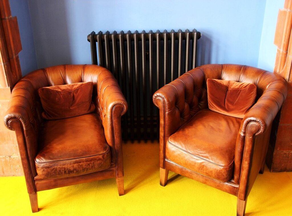
Blues: Calm, Stability, Productivity
Blue is known to lower blood pressure and promote serenity (studies from the University of British Columbia link blue environments to improved focus). Light blues feel airy and peaceful—perfect for bedrooms and bathrooms. Dark navy or indigo? More dramatic and stately, ideal for home offices where concentration matters.
- Light blue: calm and open
- Dark blue: grounded and powerful
Greens: Nature, Balance, Health
Green is considered the most restful color for the human eye, according to color perception research. Sage in a living room feels relaxed and welcoming. Emerald in a bedroom leans lush and luxurious (think old Hollywood glam). Green rarely overwhelms, which makes it incredibly forgiving.
Purples: Luxury, Wisdom, Sophistication
Historically tied to royalty, purple signals depth and refinement. Lavender soothes in bedrooms, while eggplant adds drama to libraries or living rooms.
Still frustrated your layout feels “off”? Pair cool tones with smart furniture arrangement strategies for better flow and comfort to complete the transformation.
Whites signal purity, cleanliness, and space. They make rooms feel larger, but undertones matter. A designer once told me, “Choose cool whites for crisp light, warm whites for comfort.” Cool whites can feel clinical (think sci-fi lab), while warm whites soften edges and prevent a sterile vibe.
Grays embody balance, sophistication, and formality. They are the ultimate modern neutral, shifting warm or cool depending on their base notes. “Gray lets art breathe,” a client said, and she was right. As a backdrop, it highlights texture and statement pieces.
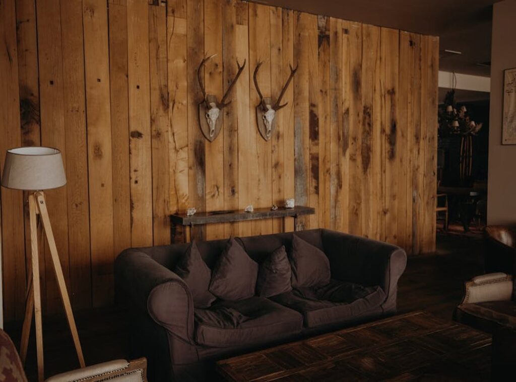
Beiges and browns bring comfort, stability, and earthiness. They ground a living room and whisper reliability (like your favorite sweater). This is color psychology in interiors at work. If comfort is the goal, consider:
- Layer sandy beige with walnut wood
- Add caramel throws for depth.
Neutrals aren’t boring; they’re the quiet heroes that let personality shine without shouting for attention. Trust neutrals.
Putting It All Together: A Room-by-Room Color Strategy
The 60-30-10 rule keeps palettes balanced: 60% dominant color, 30% secondary, 10% accent. Think of it as structure, not limitation (like a playlist with a headliner).
Room goals shift the mix:
- Living Room (Connection): Warm neutrals vs muted greens—beige feels cozy, while sage feels calm.
- Bedroom (Rest): Cool blues or lavender vs soft gray—blue soothes, gray quiets visual noise.
- Home Office (Focus): Low-saturation blues or greens vs bold brights—subtle hues sharpen attention, vivid tones compete for it.
This is where color psychology in interiors guides choices. Choose A for energy, B for ease—then layer accents to complete the 60-30-10 story. Pro tip: test swatches in morning and evening light before committing to avoid costly repainting mistakes later.
Color is still the most powerful, cost-effective way to transform a room’s mood. Instead of guessing at the paint store, you can rely on color psychology in interiors to shape atmosphere with intention.
Consider how specific shades deliver benefits:
- Soft blues lower visual stress and support sleep.
- Warm neutrals create flexible, welcoming gathering zones.
- Deep greens add focus and depth to workspaces.
Skeptical? (Fair.) Test one room and watch its purpose shift.
Bring Your Space to Life with Intention
You came here looking for clarity, inspiration, and practical direction for creating a space that truly reflects your style—and now you have it. From layout ideas to styling strategies and the deeper impact of color psychology in interiors, you’re equipped to make choices that don’t just look good, but feel right.
A beautifully designed home isn’t only about trends. It’s about solving the frustration of mismatched decor, awkward layouts, or rooms that simply don’t feel cohesive. When your space works, your daily life feels smoother, calmer, and more inspired.
Now it’s time to take action. Start by applying one concept you learned today—whether it’s refining your color palette, rethinking furniture placement, or layering textures with purpose. If you want expert-backed inspiration, practical setup tips, and curated decor ideas trusted by design enthusiasts, explore more of our in-depth guides and styling breakdowns.
Don’t settle for a space that feels “almost right.” Transform it into a home that feels intentional, balanced, and completely yours. Start your next design upgrade today.
 Virginia Warreneztira is a visionary designer and consultant known for her ability to synthesize complex aesthetic concepts into cohesive, livable environments. With an eye for bespoke interior styling and structural harmony, she focuses on creating spaces that balance architectural integrity with modern warmth. Her work often emphasizes the intersection of durability and elegance, providing homeowners with tailored frameworks that evolve alongside their personal lifestyles.