Ever walked into a room and felt an instant wave of calm or energy? It’s not magic. It’s color psychology design at work.
Many people freeze when choosing colors, defaulting to safe neutrals. I get it. I’ve spent years helping folks like you turn bland spaces into personal sanctuaries.
You’re not alone if you worry about picking the “wrong” color. But I’m here to change that for you. This article is your guide to breaking down color’s mysterious impact.
With my help, you’ll confidently use color to transform your home, no art degree needed. Let’s dive in together.
The Psychology of Color: More Than Just a Pretty Hue
Color psychology design is fascinating. It’s about how colors make us feel, often without us even knowing it. We don’t just see colors (we) experience them.
Ever walked into a room and felt instantly energized or calm? That’s color doing its magic.
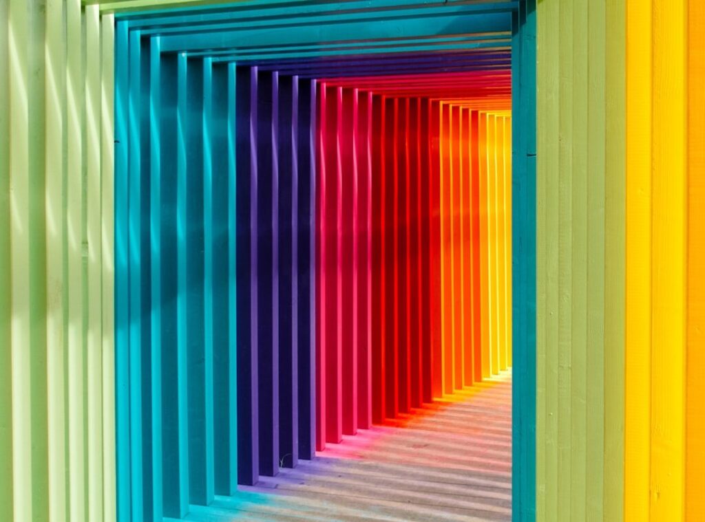
to warm colors. Reds, oranges, and yellows. These colors are like a shot of espresso (without the caffeine jitters).
They’re full of energy and happiness. Perfect for dining rooms or entryways. Why?
They encourage conversation. They invite you in. You feel welcome.
These colors can turn a space into a lively hub. Just think of a cozy café or a lively sunset that makes you want to stay.
Now, cool colors. Blues, greens, and purples. They’re the zen masters of the color world.
Calming and serene, these hues create peaceful retreats. Think about bedrooms or bathrooms. Cool colors transform these spaces into sanctuaries.
Need focus in your home office? A splash of blue can do wonders. It’s like a soft lullaby for your eyes.
These colors just whisper peace.
Neutrals have their own charm. Grays, beiges, whites. They’re the unsung heroes of design.
They ground a space. They offer balance and sophistication. With neutrals, you’re setting the stage. They provide the perfect backdrop for colorful accents.
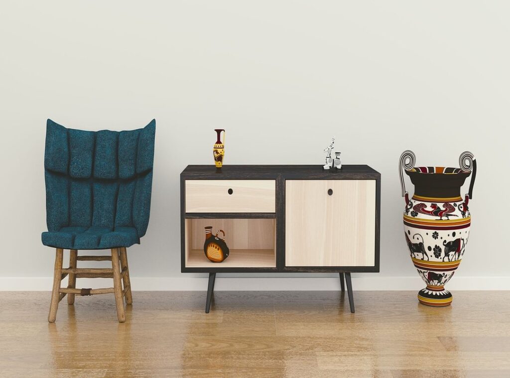
Imagine a chic, minimalist room with a bold, red vase. That’s the power of neutrals.
Colors aren’t just for looks; they shape how we live. They influence our moods. They guide our interactions.
If you’re curious about how nature fits into all this, check out the science behind biophilic design. It’s about bringing the outside in. Colors, like nature, can transform our experience.
So, next time you pick a paint color, think about what you want to feel.
How Light Changes Everything: Color’s Closest Partner
Light is the unsung hero in color psychology design. It’s what turns a paint swatch from dull to dazzling or vice versa. Ever noticed how a room feels different as the day goes on?
That’s light doing its magic (or) mischief, depending on your point of view.
Natural light is a shape-shifter. Morning light can be crisp and cool, casting a gentle glow on colors. As the sun climbs higher, it warms up, making hues pop.
By evening, shadows take over, adding depth and drama. It’s like nature’s own dimmer switch.
Room orientation? Oh, that’s a biggie. North-facing rooms get cool, indirect light.
They can wash out warm colors, leaving them looking flat. On the flip side, south-facing rooms bask in bright, warm light. They boost those same warm tones, making them sing.
Artificial light is another story. Warm-toned bulbs (soft white) give off a cozy vibe, while cool-toned bulbs (daylight) can make a room feel sterile. They dramatically alter paint colors once the sun dips below the horizon.
It’s like swapping rose-colored glasses for blue-tinted ones.
Pro tip: Always, always test paint swatches on multiple walls. Trust me, you’ll thank yourself later. Observe them at different times of day (morning,) noon, night.
You’ll see how they dance with the light. Before you commit to a color, make sure it plays nice with your room’s lighting. Want to learn more about how colors affect mood and perception?
Check out this overview. It’s a game-changer for anyone diving into design.
Color Magic: Your Home’s Secret Ingredient
Picking a color palette for your home isn’t rocket science. It’s like cooking with a simple recipe. Trust me, I’ve been there, staring at paint swatches until my eyes crossed.
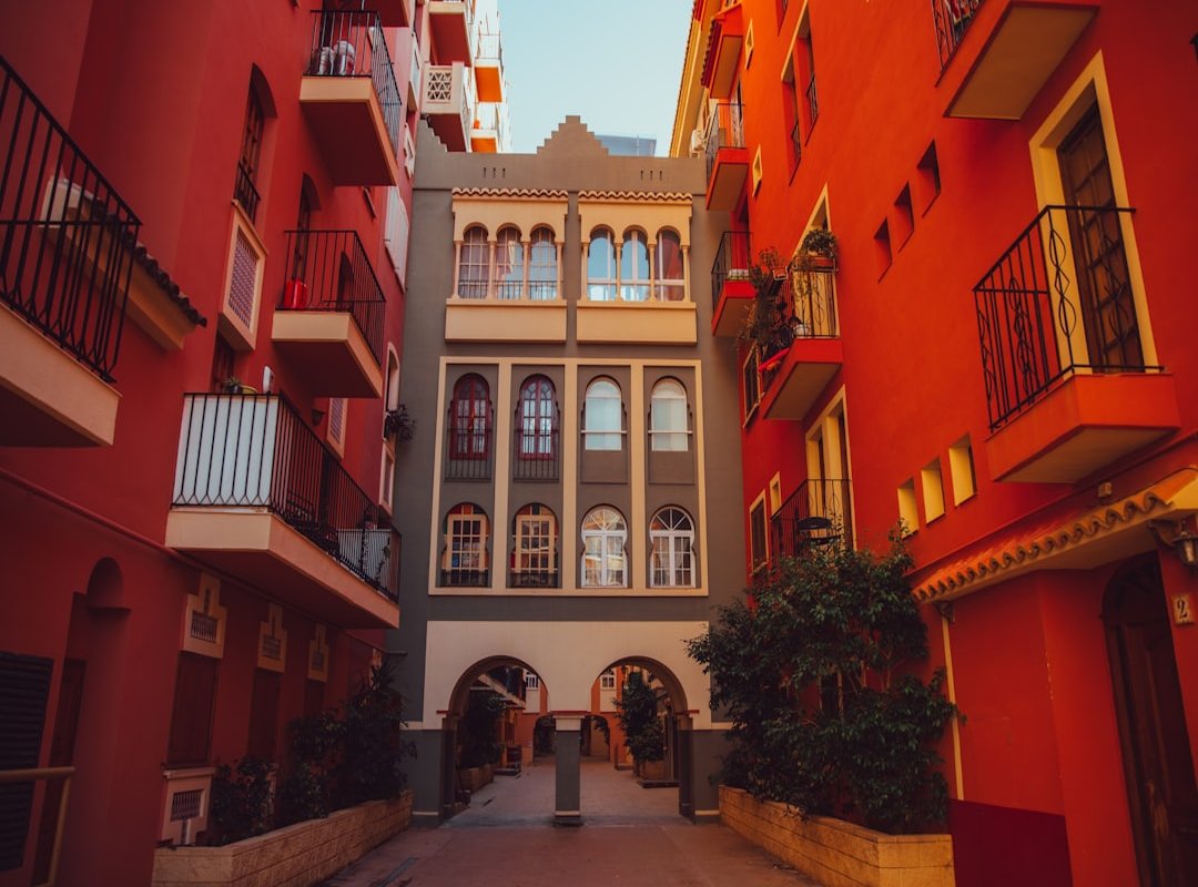
But there’s an easy way out: the 60-30-10 Rule. Let me break it down for you. Think of 60% as the main color (like your walls), 30% as the secondary color (furniture and curtains), and 10% as the accent color (think pillows and art).
It’s like dressing your room in layers.
Picture a living room: walls in a soft gray (that’s your 60%), a navy sofa (30%), and pops of yellow in cushions and art (10%). See? Easy.
Now, if you want a serene, hotel-like vibe, go monochromatic. This means using different shades and tints of a single color. Imagine a blue room with light blue walls, a navy rug, and a teal chair.
It feels calm yet sophisticated, doesn’t it?
But maybe you crave something a bit richer. Enter the analogous scheme. These are colors next to each other on the color wheel (like blue and green).
It’s all about harmony without being boring. Your room could have green walls, teal furniture, and blue accents. It’s cozy and welcoming, like a warm hug.
Here’s a pro tip: start with something you love. Maybe it’s a rug, a piece of art, or a favorite vase. Let that be your inspiration.
Colors have a way of speaking to us (color psychology design is real). They can set a mood, create warmth, and even make a space feel bigger. Curious about how Scandinavians do it?
Check out this decoding scandinavian design guide. It’s all about simplicity and natural hues.
So, what’s your color story going to be?
Color Your World: Effortless Style Tricks
Ever stare at your living room and think, “This could use some life”? I get it. Adding color isn’t about diving into painting the whole wall.
Start small. Try a bold throw pillow or a cozy blanket. These are easy to swap out and can make a big difference without breaking the bank.
Now, if you’re feeling a bit adventurous, paint an accent wall. Or give a side table a new hue. It’s all about injecting personality without creating chaos.
Trust me, a splash of color can shift the whole vibe of a room. But what if you don’t know where to start? Shop your home.
Pull colors from a favorite painting or even a book cover. It’s about uniting elements in a way that feels right.
Here’s a pro tip: texture matters. A velvet cushion and a linen curtain can showcase the same color in wildly different ways. This adds depth and interest (and makes your space feel more designed).
Remember, when it comes to color psychology design, the goal is to let the space reflect you. Play around. Experiment.
Above all, have fun with it.
Create Your Personal Sanctuary
You’ve finished your dive into color psychology design. Now, you know how colors shape the vibe of your space. That initial fear?
Let it go. Swap it for excitement and creative freedom. Imagine transforming those bland walls into a reflection of you.
Every hue tells a story. Yours.
Why wait? Pick a small corner. A nook.
A room. What feeling do you crave there? Begin dreaming.
Begin creating. Your home should welcome you every day as a sanctuary. Need help? ththomideas.net has your back with inspiration and style tips.
Start now. Your colorful journey awaits.
 Vorric Dolthane, the founder of Ththom Ideas, is a dedicated visionary focused on transforming living spaces through thoughtful interior styling and Thom-inspired decor. By combining expert technical insights with practical, everyday setup tips, he empowers others to create homes that are both sophisticated and deeply functional. Under his guidance, the platform has become a go-to resource for modern home inspiration and masterful design concepts.