
Color might set the mood, but texture brings a room to life. If your space looks well-decorated yet somehow feels flat or uninviting, the missing element is often depth created through layering textures in interior design. This guide goes beyond paint swatches and furniture placement to focus on the tactile details that add warmth, dimension, and sophistication. You’ll discover how to thoughtfully combine materials—soft with structured, matte with polished—to create balance and visual intrigue. With practical, design-backed principles and real-world styling insights, this article gives you a clear framework to transform any room from simply styled to truly unforgettable.
Why Texture Is the Secret Weapon Designers Don’t Talk About
Most rooms fail for one reason: they ignore TEXTURE. Color gets attention. Furniture gets budget. But texture? That’s the quiet overachiever.
-
Creating Visual Weight and Depth
A rough linen pillow against a smooth leather sofa instantly builds contrast. That tension creates focal points and prevents flatness. Many competitors talk color palettes; few explain how layering textures in interior design establishes hierarchy without adding clutter. (It’s the difference between a showroom and a real home.) -
Engaging the Senses
Texture shapes feeling. Velvet reads luxe. Bouclé feels cozy. Concrete feels grounded. Research shows tactile environments influence comfort perception (Journal of Environmental Psychology). A minimalist room isn’t cold if the textiles invite touch. -
Reflecting and Absorbing Light
Glossy metals and silk bounce light, adding energy. Matte wool and plaster absorb it, calming a space. Balance both, and the room feels intentional—not accidental. That’s the designer edge most people miss.
Your Essential Texture Palette: From Rough to Smooth
Design isn’t just what you see—it’s what you feel. Texture refers to the surface quality of a material, whether it’s slick, fuzzy, grainy, or ridged. Mastering your texture palette means balancing contrast so a room feels intentional, not accidental (yes, there’s a difference).
Hard & Smooth Textures like marble, glass, polished concrete, high-gloss lacquer, and metals such as chrome or brass reflect light and create a crisp, modern edge. These materials are durable and easy to clean—ideal for kitchens and bathrooms. Marble countertops, for example, are prized for longevity and resale value (National Association of Realtors notes stone surfaces remain a top buyer preference). The benefit? Instant polish without visual clutter.
Soft & Plush Textures—velvet, chenille, faux fur, cashmere, and high-pile rugs—absorb sound and soften harsh lines. Velvet upholstery not only looks luxurious but also resists crushing due to its dense weave. A plush rug underfoot adds warmth in both temperature and mood (think: stepping onto a cloud instead of cold tile).
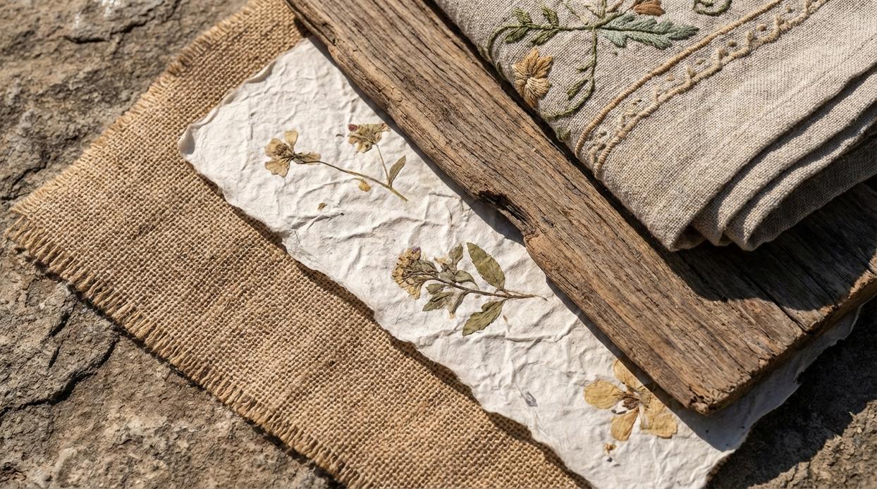
Rough & Natural Textures such as jute, sisal, reclaimed wood, rattan, linen, and stone introduce organic variation. Their irregular surfaces hide wear and add authenticity. Designers often cite natural materials as key to biophilic design, which research from Terrapin Bright Green links to improved well-being.
Subtle & Patterned Textures—bouclé (looped yarn fabric), herringbone weaves, ribbed textiles, and reeded glass—add quiet dimension. They’re especially effective in minimalist spaces. For guidance, explore minimalist styling how to achieve a clean yet inviting look.
Some argue sticking to one texture keeps things cohesive. True—but too much uniformity falls flat (like a movie with no plot twists). Use layering textures in interior design to balance contrast, depth, and comfort.
Pro tip: Combine at least one smooth, one soft, and one natural element per room for effortless harmony.
Mastering the Mix: A Room-by-Room Guide to Layering
Great interiors rarely rely on color alone. The real magic happens when you start layering textures in interior design to create depth, warmth, and contrast. Think of it like composing a playlist: you need bass, mids, and treble for the full experience (no one wants all drum solo).
The Living Room Formula
Start with a large, foundational texture. A full-grain leather sofa or a hand-tufted wool rug (often ½ to ¾ inch pile height for softness and durability) grounds the space. These substantial materials anchor the eye and add visual weight.
Layer in medium textures like linen curtains (breathable and light-filtering) and a solid wood coffee table with visible grain. These elements bridge bold and subtle.
Finish with small accents: velvet pillows for sheen, a glazed ceramic vase for smooth contrast, and a knitted throw for tactile warmth. The benefit? A room that feels curated, not chaotic.
The Bedroom Sanctuary
Comfort leads here. Pair long-staple cotton or European linen sheets (known for breathability and durability) with a chunky knit blanket for dimensional softness. Add a plush upholstered headboard for sound absorption and coziness. A high-pile rug underfoot (1 inch or more) cushions each step.
Contrast all that softness with a sleek lacquered or stone-topped nightstand. Hard surfaces sharpen the look and prevent the room from feeling overly fluffy (yes, that’s a thing).
The Dining Space Dynamic
Dining rooms thrive on contrast. A live-edge wood table showcases organic texture and natural variation, while powder-coated metal or upholstered chairs introduce refinement.
Woven placemats—rattan or seagrass—instantly add grip and warmth atop a smooth tabletop. Pro tip: Keep chair finishes consistent to avoid visual clutter.
The Bathroom Retreat
Bathrooms lean hard and glossy—tile, porcelain, chrome. So soften strategically. A slatted teak bath mat resists moisture and adds spa-like warmth. Thick cotton towels (600–900 GSM for plushness) enhance comfort.
Add a ribbed soap dispenser and a woven storage basket for subtle variation. The payoff is balance: polished, but inviting.
The Balancing Act: Common Mistakes and Pro-Level Tips
A common mistake in layering textures in interior design is crowding a space with too many small, busy patterns. Designers at the New York School of Interior Design note that visual clutter increases cognitive load, making rooms feel chaotic rather than cozy. The fix? Vary the scale. Pair a chunky knit throw with a smooth leather chair and a large-scale woven rug.
Pro Tip – The Rule of Three: Studies in visual psychology show people prefer groupings of three for balance and harmony. Aim for three distinct textures per vignette.
Pro Tip – Consider the Finish: Matte, satin, and gloss finishes subtly shift light, adding measurable depth.
Creating a Home That Feels as Good as It Looks
You set out to design a space that doesn’t just look beautiful—but feels warm, inviting, and truly lived in. Now you understand how layering textures in interior design transforms a room from visually appealing to emotionally engaging. A flat, sterile space often lacks contrast and tactile depth, leaving it disconnected from comfort. By thoughtfully mixing hard and soft, rough and smooth, you create dimension that draws people in and makes a house feel like home. Start with one room today. Add a missing texture—a woven basket, a velvet cushion, a rustic vase—and experience how one intentional change can completely shift the atmosphere.