If you’re searching for ways to create a home that feels calm, refined, and deeply personal, moody neutral interiors offer the perfect balance of warmth and sophistication. This article explores how to design spaces that embrace layered neutrals, rich textures, and intentional lighting without feeling dark or overwhelming.
Many homeowners struggle to make neutral palettes feel dynamic rather than flat. The key lies in understanding tonal contrast, material selection, and thoughtful styling choices that bring depth to a room. Here, you’ll find practical setup tips, inspiring home concepts, and expert breakdowns of how to combine shades like taupe, charcoal, cream, and warm gray for a cohesive yet striking look.
Our guidance draws from extensive interior styling research, real-world layout testing, and proven decor strategies that prioritize both aesthetics and livability. By the end, you’ll have clear, actionable ideas to transform your space into a layered, inviting environment that feels effortlessly elevated.
Your Sanctuary Awaits
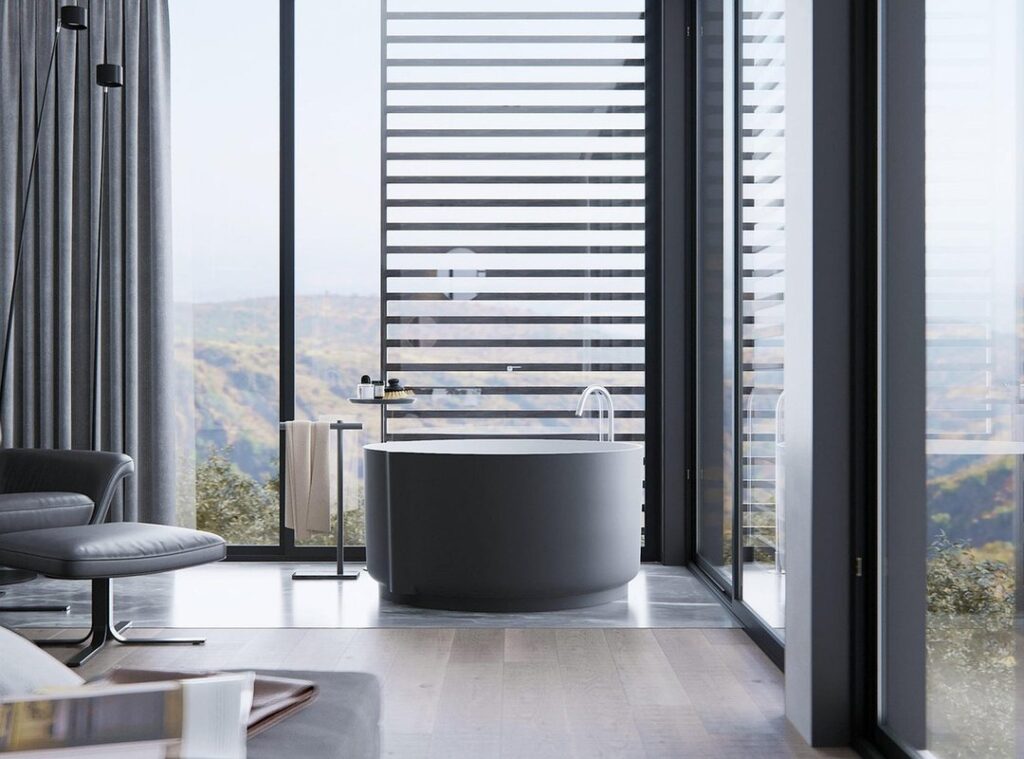
Home should feel like a retreat from relentless notifications, traffic, and to-do lists. Yet many fear neutrals equal sterile showrooms. Scenario A: bright white walls, flat lighting, minimal texture—calm but cold. Scenario B: layered taupe, stone, linen, warm wood—inviting and restorative. The difference isn’t color; it’s composition.
Neutral palette means hues without strong saturation—beige, gray, ivory, clay. When paired with texture and shadow, even moody neutral interiors feel alive.
- Pro tip: Mix three materials (wood, fabric, metal) per room for depth.
We’ll move beyond paint chips into light, material, and mood that shape emotional experience every single.
The Foundation of Calm: Understanding the Nuances of Neutral
Neutral no longer means “builder beige.” Today’s New Neutrals include warm whites, mushroom, greige (a gray-beige hybrid), taupe, charcoal, and muted earth tones like clay or sage. These shades dominate design forecasts; according to Sherwin-Williams’ 2024 Color Trends report, over 60% of featured palettes revolve around complex neutrals rather than primary colors. Why? They create flexibility and longevity (and they age far better than that neon accent wall from 2012).
The secret lies in undertones—the subtle hue beneath the surface color. Warm undertones contain yellow, red, or pink. Cool undertones lean blue, green, or violet. Benjamin Moore notes that undertone mismatch is the top reason homeowners repaint within a year. A gray with a blue base can feel icy; one with red undertones reads cozy instead.
Practical application matters:
- North-facing rooms receive cooler light, so warm neutrals prevent a dull cast.
- South-facing rooms handle cooler tones beautifully thanks to abundant sunlight.
Designers often use the 60-30-10 rule to structure space:
- 60% dominant neutral (e.g., warm greige walls)
- 30% secondary neutral (taupe upholstery)
- 10% accent neutral (charcoal or matte black)
This layering creates depth—especially in moody neutral interiors—without overwhelming the eye. Pro tip: always sample paint in multiple lighting conditions before committing.
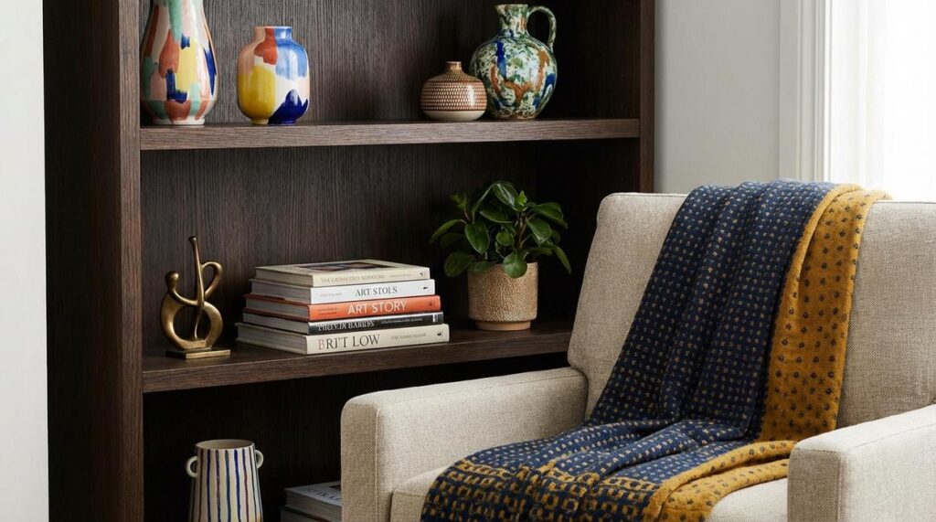
Beyond Paint: Creating Depth with Texture and Layers
Ever walked into a neutral room that looked flat, cold, and oddly unfinished? The walls are beige. The sofa is cream. The rug is… also beige. And somehow it still feels wrong. That’s because paint alone doesn’t create depth.
Here’s the truth: texture is the single most important element in a successful neutral interior. Texture refers to the visual and tactile surface quality of materials—how something looks like it would feel. Without it, even the most expensive space falls flat (yes, even those Pinterest-perfect living rooms).
Some people argue color should do the heavy lifting. But in moody neutral interiors, color is intentionally restrained. Texture becomes the storytelling device.
A Vocabulary of Textures
Layer contrasting materials to create tension and warmth:
Soft Textures
- Bouclé
- Chunky knit wool
- Belgian linen
- Velvet
- Sheer cotton curtains
Hard & Natural Textures
- Raw wood
- Rattan
- Jute or sisal rugs
- Stone or marble accents
- Smooth metal finishes (brass, matte black)
The frustration? Many rooms rely on one category only. A linen sofa, linen curtains, and a flat-weave rug. It blends together like visual white noise.
Actionable Tip: Make sure every sightline in your room includes at least three different textures. For example: a velvet chair, a raw wood side table, and a jute rug. That contrast creates dimension instantly.
If you’re drawn to layered simplicity, explore warm minimalism softening clean lines with texture for deeper inspiration.
Because “neutral” should never mean boring.
Strategic Accents: Bringing Life to Your Neutral Canvas

I once redesigned my living room after realizing it felt like a high-end showroom—beautiful, but oddly lifeless. The walls were warm beige, the sofa oatmeal, the rug soft taupe. It was the perfect example of moody neutral interiors. And yet, something was missing.
That’s when I learned the power of subtlety. Accents in a neutral room shouldn’t shout; they should whisper. An accent—a small decorative element that contrasts with the main palette—works best when it gently guides the eye rather than hijacks it.
First, nature. I added a deep green fiddle-leaf fig and a walnut side table. Instantly, the space felt grounded. Studies show indoor plants can boost mood and reduce stress (Journal of Environmental Psychology, 2015). Natural wood tones add warmth without disrupting calm.
Then, muted color pops. A dusty blue cushion. A small terracotta vase. A sage throw. Desaturated colors—tones softened with gray—blend rather than blare. Even a single mustard pillow can shift the mood (less “hospital waiting room,” more “effortlessly curated”).
Finally, a touch of black. A thin metal lamp base and picture frame anchored everything. Black acts as visual punctuation—it defines edges and makes softer hues feel intentional.
Sometimes, the smallest accents make the loudest difference.
Lighting is Everything: Sculpting a Serene Atmosphere
People obsess over paint swatches in neutral rooms. I disagree. In moody neutral interiors, light and shadow are the color. When walls, floors, and textiles sit in the same tonal family, contrast doesn’t come from hue—it comes from illumination. A warm glow can make beige feel golden; a harsh bulb can turn it flat and lifeless (like an office at 4:59 p.m.).
The Layered Lighting Strategy
- Ambient Lighting: Dimmable overhead fixtures or soft ceiling washes at 2700K. This is your base note—the quiet hum that fills the room.
- Task Lighting: Floor lamps for reading nooks, under-cabinet lights in kitchens. Function first, but style never hurts.
- Accent Lighting: Picture lights and small table lamps that create intimate pools of warmth.
Some argue natural light is enough. It’s not. Even daylight shifts hourly.
Expert Tip: Put every source on a dimmer. Control transforms a space from bright and airy to cocooned and cinematic in seconds.
Crafting your personal haven isn’t about stripping a room bare; it’s about intention. A truly calming neutral interior is a deliberate composition of shade, texture, and light. If you’ve feared that serenity means boring, think of Nancy Meyers movie sets—soft, layered, lived-in, NEVER flat. The secret behind moody neutral interiors is depth: woven throws, raw wood, brushed linen, and light you can dim like a cinematic close-up. Start small:
- Swap a lampshade
- Add a textured throw
- Bring in a plant
One layer at a time, and your space shifts from plain to SANCTUARY. Pro tip: vary finishes.
Bring Your Vision to Life with Moody Neutral Interiors
You came here looking for clarity on how to design moody neutral interiors that feel layered, inviting, and timeless — not flat or lifeless. Now you understand how to balance deep tones, soft textures, thoughtful lighting, and curated decor to create a space that feels intentional and elevated.
The biggest frustration with neutral spaces is that they can easily fall dull or unfinished. But when done right, they deliver warmth, depth, and effortless sophistication without overwhelming your home. With the right styling approach and practical setup techniques, you can transform any room into a grounded, cohesive retreat.
Now it’s time to take action. Start by refining your color palette, layering rich textiles, and rethinking your lighting to create dimension. If you want step-by-step inspiration, expert breakdowns, and proven styling ideas trusted by thousands of home enthusiasts, explore our latest guides and start designing your space today. Your perfectly balanced, beautifully styled home is just one thoughtful update away.
 Helen Rogersofers is a leading expert in functional home optimization and contemporary decor themes. She specializes in translating high-level design theory into practical, accessible setup strategies that maximize the potential of any floor plan. Through her insightful breakdowns and focus on material textures, Helen empowers individuals to refine their surroundings with confidence, making sophisticated design achievable for the everyday enthusiast.