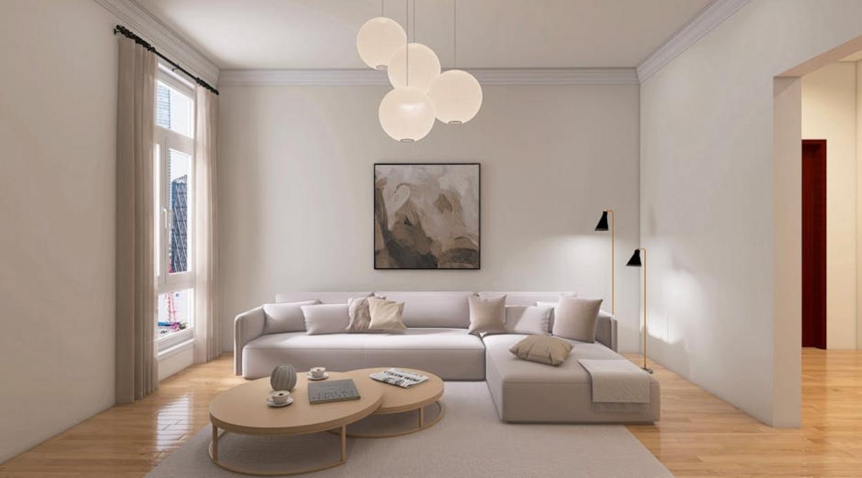
If you’re searching for ways to make your space feel striking, modern, and intentionally styled, this guide to high contrast interior design will give you the clarity and direction you need. Many homeowners love the bold look of contrasting light and dark elements but struggle to balance drama with harmony. Done wrong, it can feel overwhelming. Done right, it creates depth, sophistication, and visual impact that instantly elevates a room.
In this article, you’ll discover how to use contrast effectively—through color pairings, furniture choices, lighting, textures, and layout decisions—so your space feels curated rather than chaotic. We break down practical setup tips, styling principles, and real-world applications to help you confidently apply these ideas in your own home.
Our insights are grounded in expert interior styling approaches and careful analysis of what makes bold spaces both functional and timeless. By the end, you’ll understand exactly how to create contrast that feels intentional, balanced, and beautifully designed.
The Art of the Statement: Why Contrast is King in Modern Interiors
Bland rooms fade into the background; contrast makes them unforgettable. By pairing light with dark, rough with smooth, and old with new, you create visual tension—the dynamic interplay that keeps the eye engaged. In other words, high contrast interior design turns a space from passive to powerful.
As a result, your home feels curated rather than accidental. Guests notice the drama of a black sofa against crisp white walls (yes, like a classic film still), and you enjoy rooms that energize instead of exhaust.
It sharpens your vision.
Mastering color and texture contrast sounds simple—until you overdo it. I once paired cobalt walls with a orange sofa, thinking complementary colors (opposites on the color wheel, like blue and orange) would balance themselves. They didn’t. The room felt like a sports bar during playoffs. Lesson learned: visual tension needs control.
Complementary colors create energy, while high-contrast pairs (extremes like black and white) create drama. Both fuel high contrast interior design, but without structure, they overwhelm.
The same goes for texture. Pairing rough with smooth (brick and silk), matte with glossy (concrete and lacquer), or hard with soft (wood and velvet) adds depth—if one leads and the other supports.
Use the 60-30-10 rule:
- 60% dominant color
- 30% secondary tone
- 10% bold accent
Start with a neutral base, then layer one daring color and one contrasting texture through pillows or a statement chair. Bold works when edited.
Style Deep Dive: Art Deco’s Geometric Glamour
I still remember the first time I walked into an Art Deco–inspired apartment in downtown Chicago. The moment the light hit the sunburst mirror above the fireplace, the whole room seemed to glow (in a very Gatsby-at-golden-hour way). That’s the magic of Art Deco—a design style from the 1920s and ’30s defined by luxury, symmetry, and bold geometric patterns.
At its core, Art Deco embraces structure. Symmetry means balanced repetition—think matching armchairs or identical sconces framing a mirror. Geometric motifs like chevrons and stepped forms echo the era’s fascination with progress and industry (the Chrysler Building is a classic example, according to the NYC Landmarks Preservation Commission).
What truly sets it apart, though, is color. Deep jewel tones—emerald green, sapphire blue—paired with high-shine metallics like gold or chrome create dramatic contrast. Add stark black and white, and you’ve mastered high contrast interior design without overwhelming the eye.
Then there’s texture. Polished marble and lacquered wood (lacquer is a glossy finish that amplifies shine) feel even richer beside plush velvet or faux zebra print. It’s all about tension—sleek against soft.
If you’re hesitant, I get it. Some argue Art Deco feels too flashy for modern homes. I once thought the same—until I added a channel-tufted velvet armchair to my living room. Suddenly, everything felt intentional.
Start small. A mirrored bar cart with gold trim can anchor a space beautifully. For more bold glamour, explore glamorous living spaces inspired by hollywood regency style—a natural cousin to Deco drama.
Style Deep Dive: Maximalism’s Curated Chaos
At first glance, maximalism can look like pure disorder. In reality, it’s a carefully layered design philosophy built on intention. The core idea is simple: more is more. Instead of editing down, you build up—patterns, colors, textures, and objects that reflect your personal history and passions.
So what makes it work? First, let’s clarify a common misconception. Maximalism is not clutter. Clutter is random accumulation. Maximalism is curated abundance—a deliberate arrangement of meaningful pieces (yes, there’s a difference).
When it comes to color, there are no strict rules. Hot pink can sit next to forest green. Stripes can mingle with florals. The key is cohesion, often achieved by repeating hues across elements. This approach overlaps with high contrast interior design, but instead of stark minimal pairings, maximalism multiplies the drama.
Next, texture plays a major role. Imagine bouclé beside leather, fringe layered over rattan, and a high-pile rug grounding it all. Texture layering simply means combining materials with different tactile qualities to create depth. Think of it like composing music—each material adds a note.
Key elements tie everything together: gallery walls, layered rugs, statement wallpaper, and proudly displayed collections. To get started, begin with bold wallpaper. A large-scale floral or chinoiserie print provides a color roadmap for the entire room.
In the end, maximalism isn’t chaos. It’s personality—turned all the way up.
Style Deep Dive: Modern Industrial’s Raw Refinement
Back in the early 2000s, when converted warehouses first started trending in major cities, modern industrial design shifted from gritty necessity to intentional style. What began as exposed pipes and salvaged beams (because that’s what was there) evolved into a curated aesthetic built on contrast and comfort.
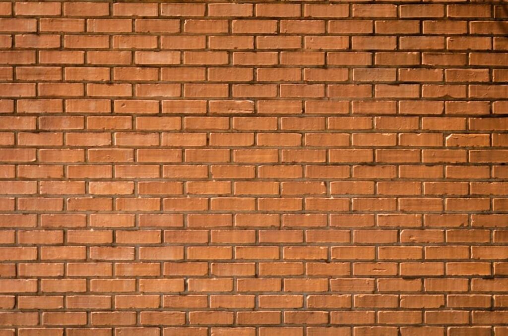
At its core, modern industrial celebrates raw, unfinished materials—think exposed brick, visible ductwork, and expansive metal-grid windows—while layering in clean-lined furniture for balance. This tension is what designers call material juxtaposition: placing opposing textures together to heighten their impact. Rough brick against a sleek leather sofa. Cold concrete floors softened by a high-pile wool rug. Smooth steel paired with distressed wood.
The color story anchors the look. Charcoal gray, warm cognac, and stark white create a grounded base, while matte black adds definition. It’s a masterclass in high contrast interior design without feeling chaotic.
Key elements often include:
- Edison bulb lighting
- Black metal pendants
- Wood-and-metal furniture silhouettes
After about a decade of experimentation, designers realized lighting makes or breaks the space. Focus on statement fixtures first. A minimalist floor lamp with an exposed bulb can instantly tilt a room industrial (yes, even in a suburban condo). Pro tip: keep décor minimal so the materials do the talking.
Bringing Your High-Contrast Vision to Life
Now that you have a roadmap, it’s time to act. Personally, I believe bold rooms aren’t born from playing it safe—they come from decisive contrast. That’s why high contrast interior design feels so powerful; it forces a space to say something instead of whispering.
Of course, some argue strong contrasts can feel overwhelming. Fair point. However, when balanced with texture and intentional styling, the tension becomes energy (the good kind).
To begin, try this:
- Pick one room.
- Choose one standout contrast.
- Commit fully.
In my experience, momentum follows courage. So start small—but start today.
Bring Your Vision to Life with Confidence
You came here looking for clarity, inspiration, and practical direction for creating a space that truly reflects your style. Now you have a clearer understanding of how to apply high contrast interior design with purpose—balancing bold elements, thoughtful textures, and intentional layouts to transform any room.
Design confusion and second-guessing can stall your progress. It’s frustrating to have a vision in mind but not know how to execute it without overwhelming the space. The key is taking what you’ve learned and applying it step by step—contrast your tones, anchor your focal points, and layer with intention.
Now it’s time to act. Start with one room. Choose your dominant contrast, define your statement pieces, and build around them with confidence. If you want more expert-backed ideas, practical styling breakdowns, and proven layout tips trusted by design enthusiasts, explore our latest guides and start transforming your space today.